Stencils tagged with ‘responsive’
Square Wireframe Kit
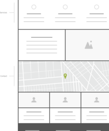
Square Wireframe Kit provides a simple, flexible, and fun way to wireframe. Simple square blocks can be easily resized, rearranged, stacked, and edited to build wireframes for anything from a traditional website to a mobile app. If you need to show more detail, squares come in two versions so you can switch between mock...more
Blenderbox UX Wireframe Kit
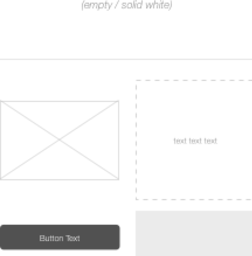
Gee, printer-friendly! Sometimes, there’s nothing better than printing out a design and just marking it up. When we noticed that our clients were printing our wireframes, we decided to do away with the typical 11″×17″ canvas and create our own stencils, formatted for regular printer paper. This pen-ready baby is outfitted...more
Responsive Website Wireframe Kit
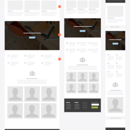
Rapid Wireframing for Desktop, Tablet and Phones. Our massive wireframe library has 30 pages of content blocks, website elements, icons, wireframe examples and templates. Every single component comes in three sizes to quickly create wireframes showing desktop, tablet and phone layouts. The templates can also be used to...more
Flat and Cool UI
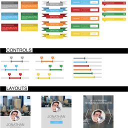
Responsive web and flat UI design is the current trend. This file satisfies that trend giving you all of the components and web elements needed that is responsive-ready! Graphs, buttons, checkboxes, drop downs, search boxes, notifications, radio buttons, controllers, sign in form, CTAs (call to actions), hero, register form...more
1200px Grid
Hey Grafflers: Here's a 12-column, 1200px grid. It's got 80px columns with 10px gutters, and is baked into a layered and editable 1440px Chrome-inspired desktop browser. Double-whammy.
Less Framework v4 Stencil
This stencil supports the Less Framework (v4) for creating grid-based, responsive web designs for standard, tablet and mobile devices. (See: lessframework.com). We've created this in the effort to encourage interaction designers and information architects to consider grid-based design in their prototypes and wireframes.


